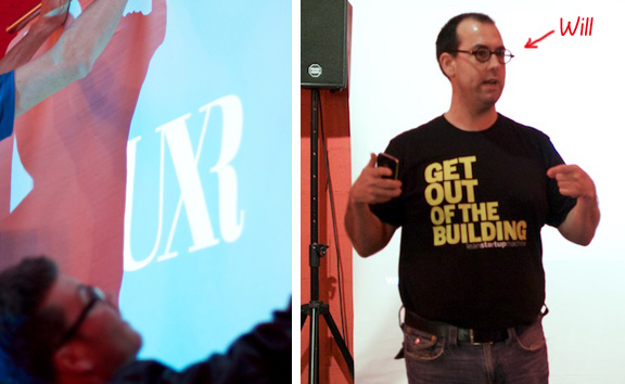
On October 23 we had a chance to attend a 3 hour « Design Studio Workshop » organized by UX Romandie and got tutored by one of Design Studio’s main evangelists Will Evans (@semanticwill). Some 40 participants got together in a charming place called La Datcha in Lausanne, ready to learn something new.
What is Design Studio?
The Design Studio is a fast-paced, highly interactive and focused methodology that provides a collaborative and pragmatic process of illumination > sketching > presentation > critique > iteration (technically we called this a charrette). It uses a case study approach to solve unique and clearly defined problems. Its main goal is to motivate collaboration, to generate and explore a wide selection of different ideas and to allow an open and constructive critique in order to achieve solid and bold design solutions.
The workshop
The 1st round began by creating small interdisciplinary teams of 5-6 people. Each of the team got equipped with standard goodies as bunch of post-its, multiple color markers & pencils, sketchboards, Design Challenge brief, persona description and a stopwatch. As mentioned earlier, Design Studio workshops are truly fast-paced > think about getting yourself a timer that will help you being on time.
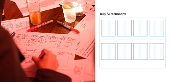
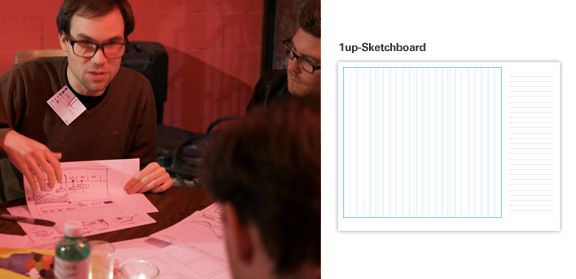
Working materials: Design Challenge , Persona , 8up-Sketchboard, 1up-Sketchboard
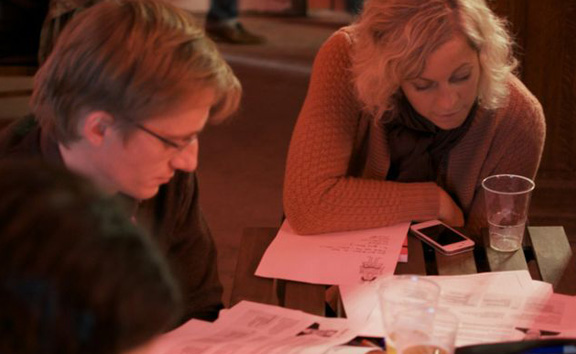
To fully understand the design challenge of the workshop we started with the ‘illumination phase‘. We were asked to think about (without technology constraints, device limits… ) design solutions of how to manage a personal reputation and personal brand across social network platforms. Studying closely the given design brief and persona description gave us a clear insight of the problem statement. And in order to articulate it clearly we used the principe of 4 C’s, separating Components (elements of the topic), Characteristics (features of the topic), Challenges (obstacles associated with the topic) and Characters (people associated with the topic) into a chart.
Illumination
When the Design Challenge got clear for everybody we moved into the « sketching phase » where we used a method called 6-8-5 method that stands for producing 6 to 8 sketches in 5 minutes. So each team member was asked to grab a big marker* and individually sketch (not write) at least 6 to 8 ideas that mapped to persona’s goals and needs. Here it was all about quantity and NOT quality. The objective was to generate as many concepts as possible without judging whether they are good or bad.
*By using big markers and fat lines to sketch you focus much better on essential points of your idea. You are less discracted to draw little details that are not yet important at this phase.
Sketching
Once done, each team member got his 3 min of fame during the « presentation phase« . He/she had to argument and ‘sell’ his/hers core ideas to teammates, who were then invited to express their critiques; positive AND negative. The point was to find weaknesses and strengths of the concepts and questioning how these solutions meet persona’s needs.
A round of presentations and critique has been followed by ‘iteration phase’ . We’ve analyzed the comments received and applied them to the initial sketches in order to make them better. But due to the lack of time it was recommended to pick up only the strongest idea and build the iteration upon it.
Individual presentation of concepts to the team
So far so good … but the 2nd round of the workshop started with a little surprise – we had to abandon our team and find a place in a new one. By doing so, we had an opportunity to rethink our initial concept (in case we didn’t like it), change it, reinterpret it, remix it, even ‘steal’ interesting ideas from our former teammates and repeat the sketching phase and prepare the final proposition. Then we were once again given 3 minutes to present it and finally choose THE project that the team would work on together for the final pitch.
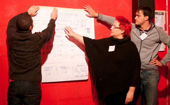
Here we’ve entered into the 3rd round. Fully armed with big A1 sheets of papers and markers we had 30min to elaborate our project. At this step it was very important to focus, communicate the ideas clearly, take good decisions quickly enough for not loosing time and pick up the best sketching master.
The workshop ended with project presentations. Each team had 3 minutes to pitch their idea, tell a story and sell it to the public. All the teams have proudly presented their concepts and then Will invited the public to critique the project. The critique was not suppose to be about « i like/i don’t like ». It had to be based on evaluation whether the design concept meets the goals the team wanted to achieve. And most important – the critique is not about pointing out only the weak points of the concept. It should refer also to its strong ones, showing at least two or three ways how the concept solves the problem.
In a normal full-length Design Studio Workshop we would, at this point, start a new iteration; go back behind the table, study the critiques, sketch and present an updated concept. But we sadly ran out of time. 3 hours was only enough to get introduced into the Design Studio methodology. But I believe we all learnt a lot.
Personally I found it very interesting how strict time-boxing (even if it can sometimes feel stressful) works… every time! Deadlines are crucial. They demand your full focus and dedication on what you are working on and consequentially you are impressively more productive and efficient.
Switching teams was surprising and I think it had a very positive impact on the rhythm of work and boosted the dynamics of finding new ideas. Explaining your concept to a fresh pair of ears and eyes gives you valuable insights for improvements. So when you work on your projects, keep it in mind that you don’t want to stay isolated in your corner. You should rather share it and talk about it with others.
And finally my favorite experience… turning our backs towards the public when receiving their critique. At first it felt a bit strange, but you understand quite quickly that people express their opinions much easier when they don’t address you « directly ». In addition the critique feels more constructive and less personal.
Thanks a lot Will and till next time!
————
Photos by UXRomandie
Working materials by Will Evans

